Reports: Added a Horizontal Bar Chart for Custom Reports
Feature Announced: January 24, 2019
Feature Released: January 30, 2019
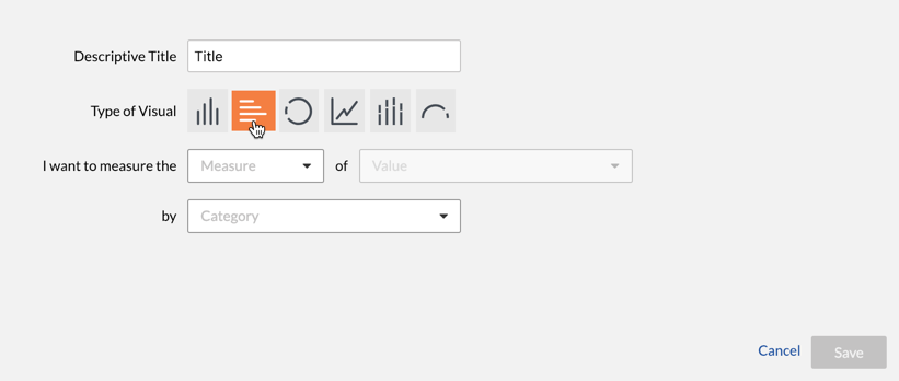
New Horizontal Bar Chart for Custom Reports
Procore has updated the Company and Project level Reports tool to give report creators the option to add a Horizontal Bar Chart when adding visuals to custom reports. The new option is available in the page that appears when you click the Add Visual button in a custom report.
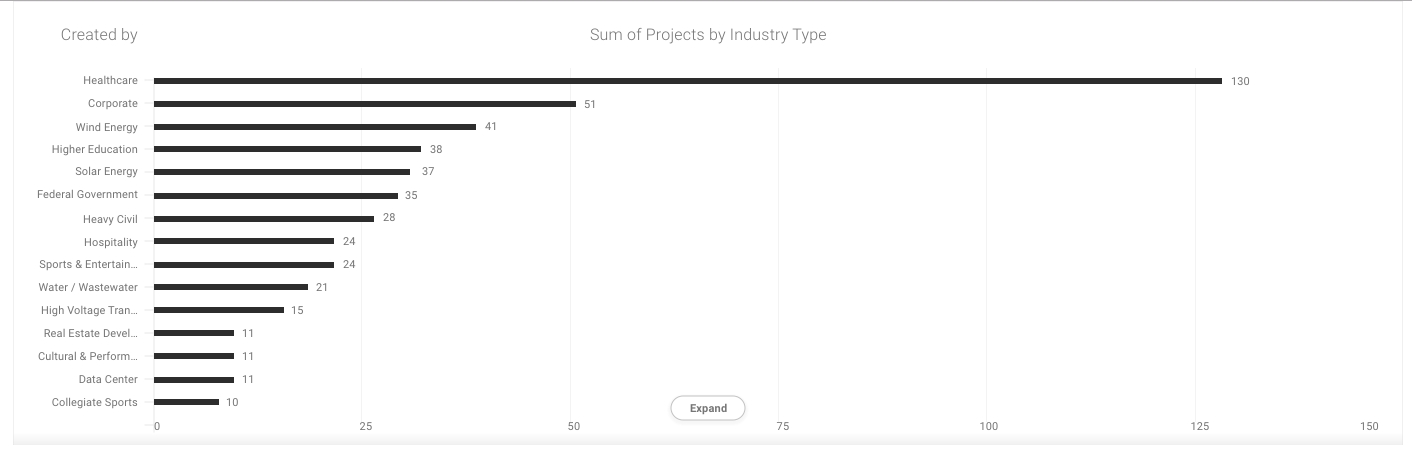
Example
Why is this important?
A horizontal bar chart is a useful option that provides for visual comparisons between categories of data.
See Also
If you would like to ask questions or share any feedback, please contact support@procore.com.